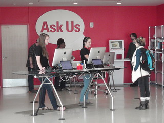
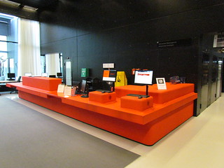
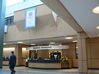
The Reference / Info Desk is a focal point in any academic / public / special libraries. It’s one of the places where you see long queues of students / faculty / visitors waiting for their turn to inquire on library collections / services / and so forth. (Though in this technology-driven era, you don’t get to see these quite often).
I’m not going to discuss in depth about what are the things that user(s) often ask at the desk. It’s the design of the Reference Desk that intrigues me. Out of curiosity, I ‘flickred’ and got some photos:

For those of you that have an account with Pinterest, check out this board: Information Desks.

Everyone has their own taste, their own preference of a Reference / Information Desk. Here’s mine:
- Located near the entrance of the library; that’s where most traffic occurs
- Visually appealing to the eyes (subjective; beauty in the eyes of the beholder)
- Desk height: Not too high
- Catchy signage – perhaps with a tagline as well
- Electronic Tickler
- Two-way screens so that the user is able to follow the staff explanation
- Seats for our users
- A detachable side table that is also adjustable
On top of that, I believe that it’s time to change the one in mine.
